Peerdom
Brand identity and landing page for Saas start-up
The Opportunity
Peerdom, a SaaS start-up, was looking to revitalize their brand identity, which had grown outdated. The brand’s color palette was muted, and the overall corporate appearance lacked the vibrancy needed to attract their target audience, especially in the Tech and innovation space. I was brought on board to lead the rebranding, and design a landing page targeting mergers and acquisitions (M&A), that would resonate with Peerdom's users and drive conversions.
Design Approach
Conduct industry research and competitor analysis
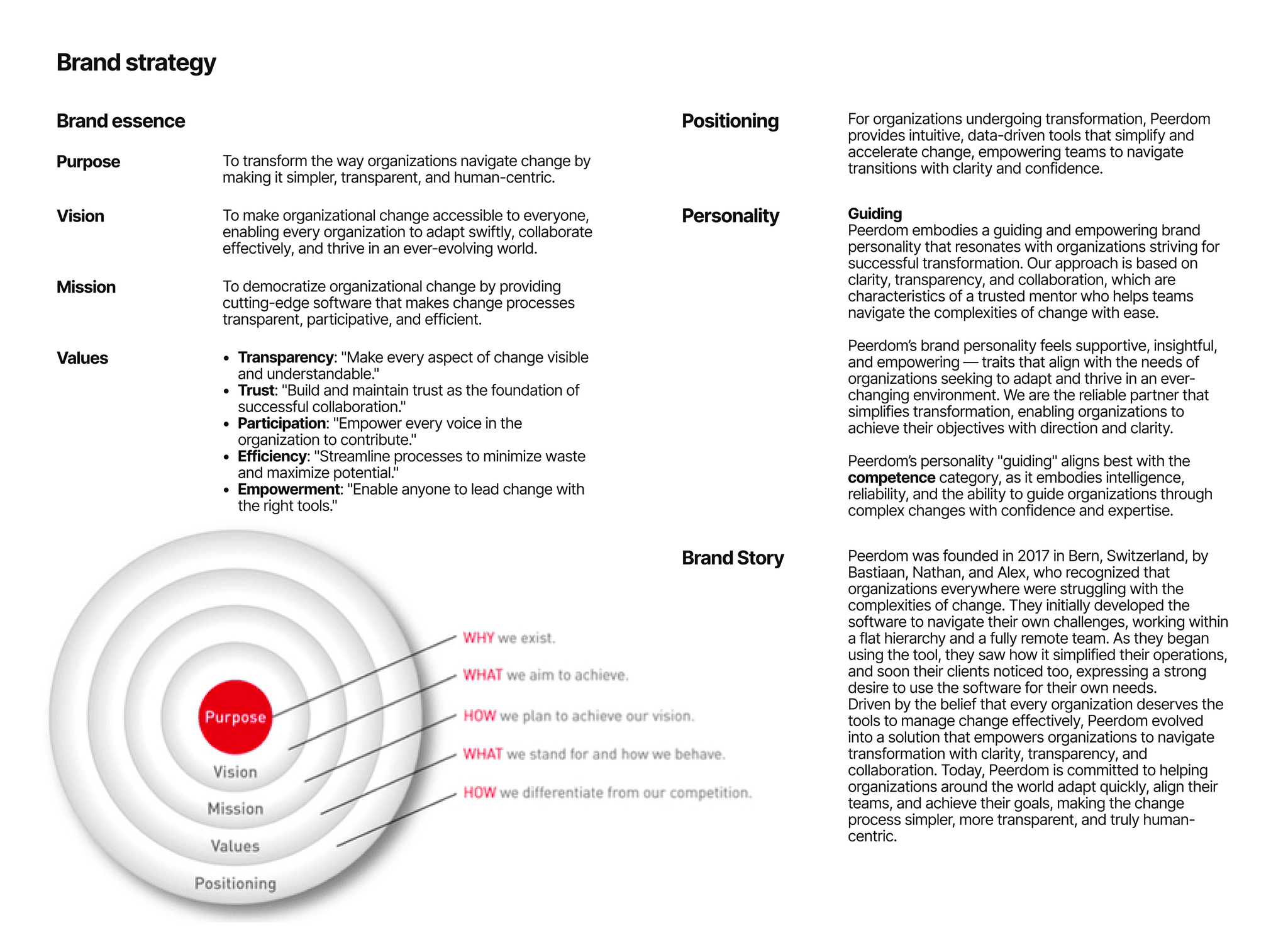
Develop a solid brand strategy
Design an attractive visual identity
Develop user-friendly high-converting landing page
Project Specifications
My Roles:
Project Lead
Web Designer
Brand Designer
Visual Designer
Deliverables:
Brand & website audit
Brand strategy
Visual identity
High-fidelity landing page prototype
Duration: 3 months
Tools:
Figma
Illustrator
Photoshop
GitLab
Research
Audit
I kick off the project by assessing the brand and website to identify areas for improvement.
Analysis
Brand strategy
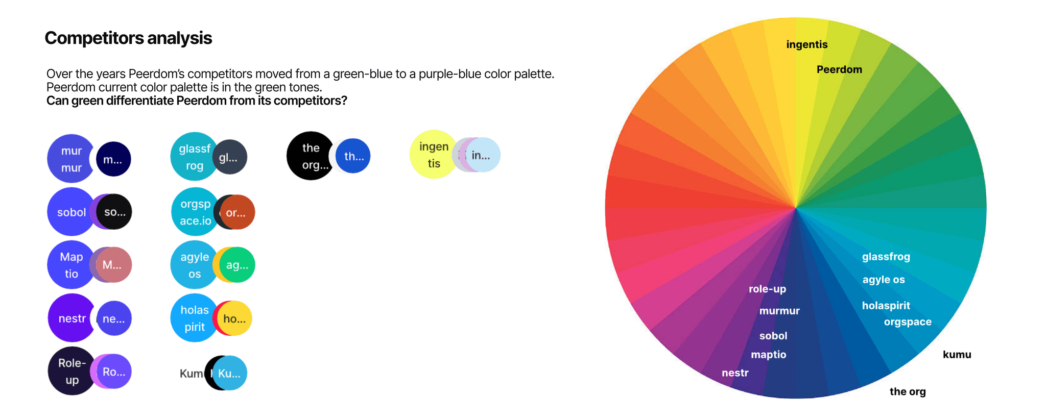
I conducted an in-depth research and analysis of Peerdom's competitors and industry trends, before developing the brand strategy. This gave the project on a solid strategic foundation which guided the visual identity and ensured its alignment with the business needs.
Design
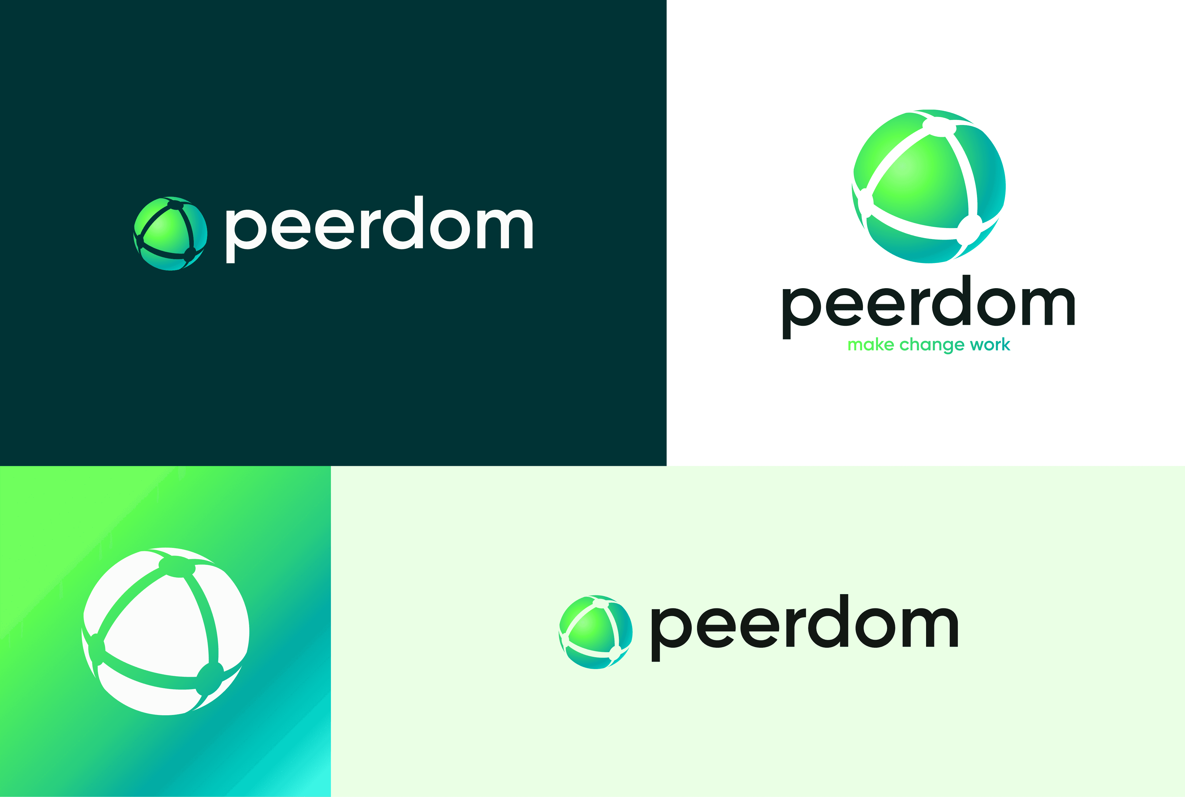
Visual Identity
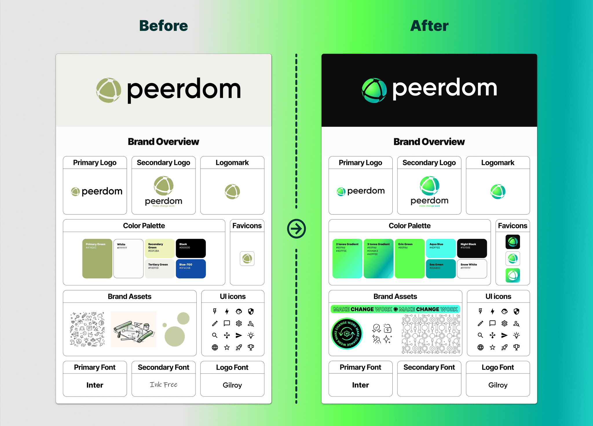
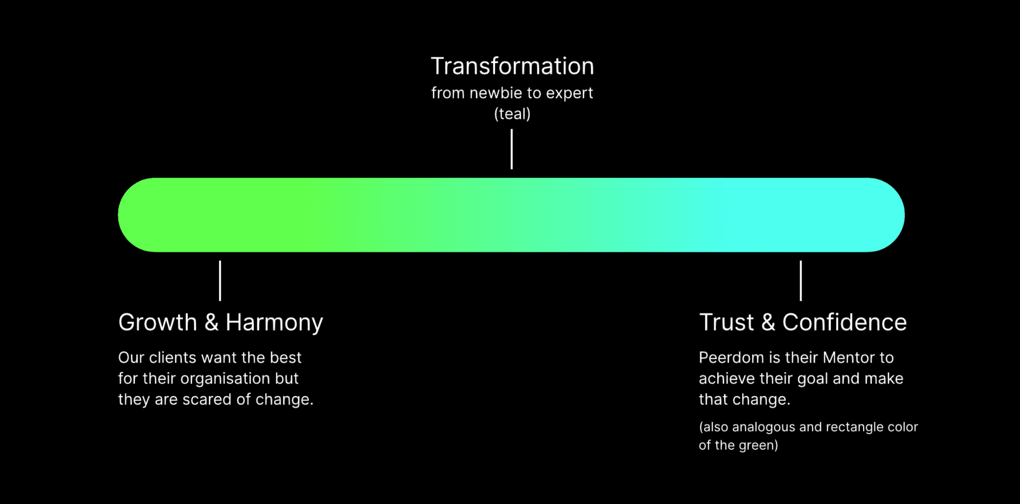
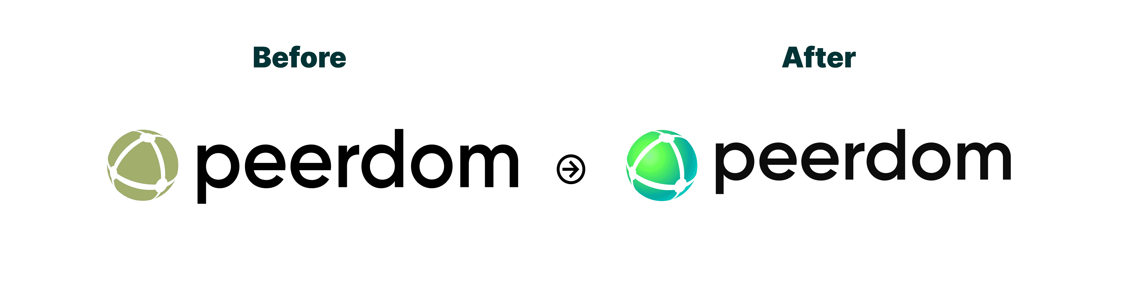
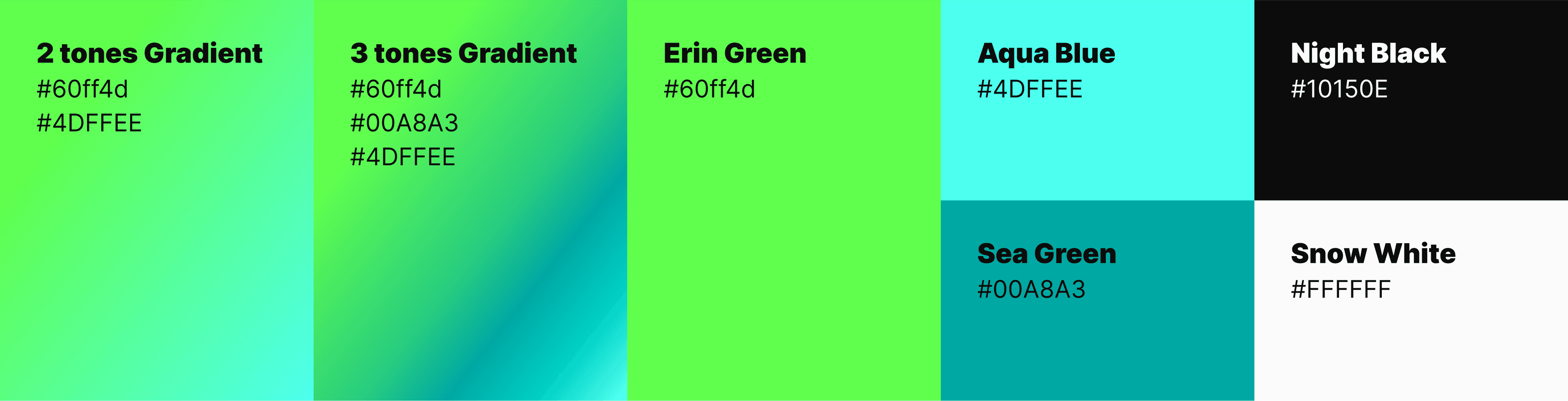
In assessing Peerdom’s brand, I identified a need to update its color scheme to better reflect its role as a “change management tool” and “change maker.” To stand out from competitors using purple and blue, I retained green as the primary color but heightened its saturation for impact. I introduced a gradient from green to blue, symbolizing growth, harmony, trust, and confidence. This gradient tells a story of transformation, aligning with Peerdom’s mission to guide users from “newbie” to “expert” and visually reinforcing its values of positive change and mentorship.
Project Constraints
Working within certain constraints allowed us to focus on strategic enhancements without inflating costs. The project required keeping the existing logo shape, the primary font (Inter), and the icon and illustration library. These parameters directed our approach, ensuring that every design choice was impactful yet aligned with Peerdom’s budget. By focusing on color and layout refinement, we delivered a refreshed brand identity that aligns with Peerdom’s goals and resonates with its audience.
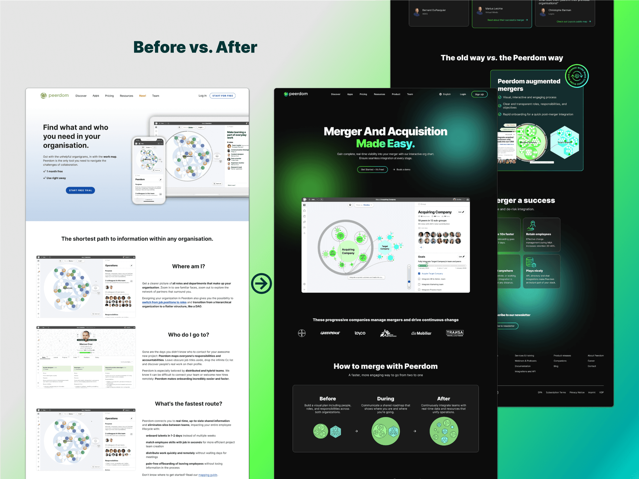
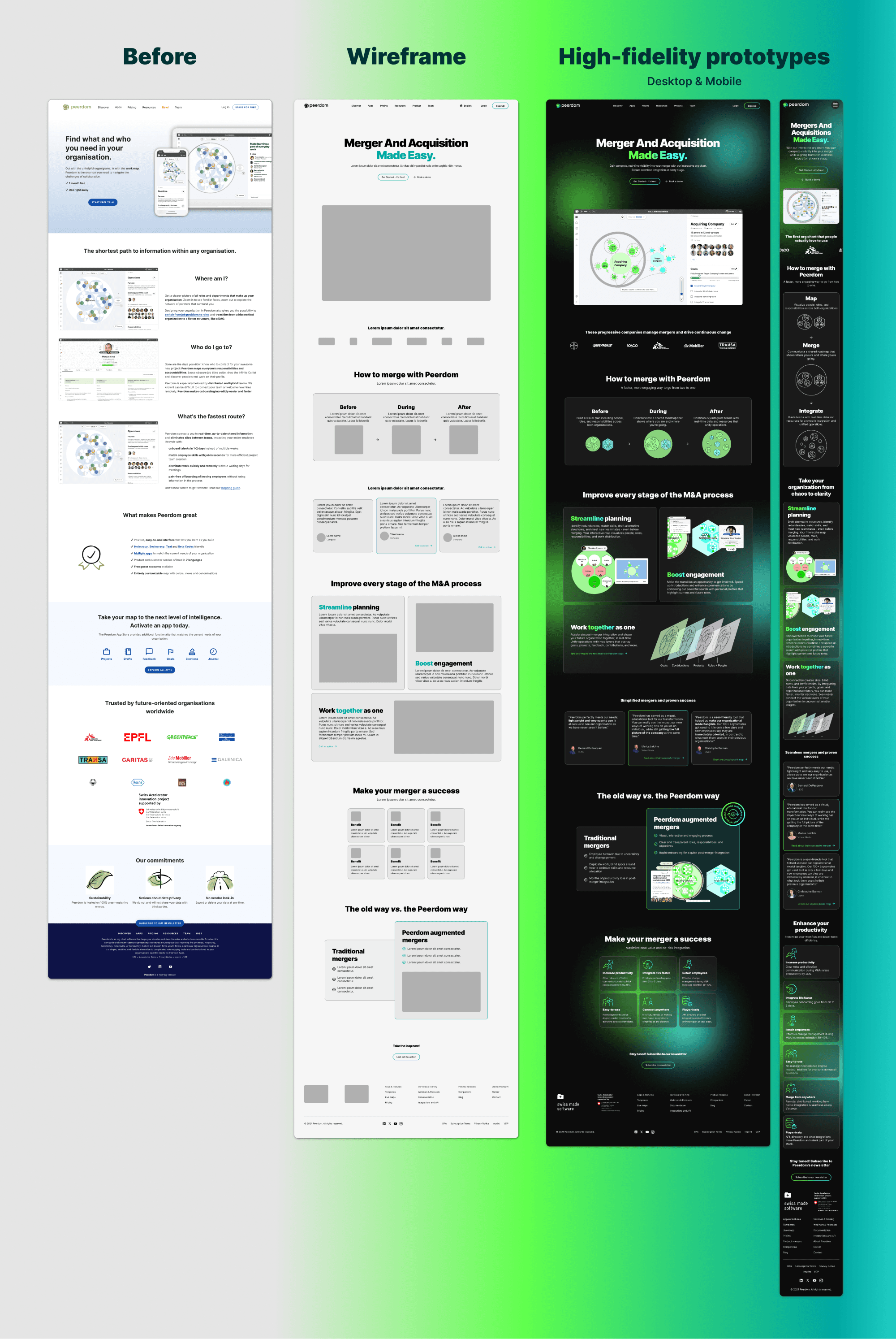
High-fidelity Prototype
The landing page design process began with wireframes and alignment on marketing messaging to establish a user-focused structure. This was followed by fully integrating Peerdom’s refreshed visual identity into high-fidelity prototypes for both desktop and mobile. I created branded visuals to support the communication.
As project lead, I managed timelines, coordinated team efforts, and maintained strategic focus, delivering a cohesive, high-converting landing page.
© 2025 · Lyne O-R