MyMenuIQ
Digital Nutrition Service for Nestle
The Opportunity
As part of my role as Designer at Nestle, I led the UX/UI design of the digital product and services of the Food department. MyMenuIQ is a new nutritional service that help users build a healthy and balanced menu. In addition, the user has direct access to recipes and shopping list.
Design Approach
Translating project into an intuitive user flow
Developing user-friendly menu building process
Design user-centered website and mobile web app
Project Specifications
My Roles:
UX/UI Designer
Brand Designer
Visual Designer
Deliverables:
Flow diagram
Mid-fidelity wireframe
High-fidelity prototype
Duration: 1 year
Tools:
Figma
Illustrator
Photoshop
InDesign
Mural
Research & Analysis
Website Analysis
The team expressed dissatisfaction with the design agency's work, leading them to entrust me with the UX/UI design led of the project. My initial steps involved a thorough analysis of the agency's deliverables, where I identified and pinpointed the user experience issues.
User Flow
After a comprehensive analysis of the initial agency proposal, I reimagined and enhanced the user flow of MyMenuIQ. Recognizing the need for a more intuitive and efficient user journey, this new user flow aimed to simplify the process of creating a balanced menu and accessing recipes, resulting in a more user-centric and straightforward experience.
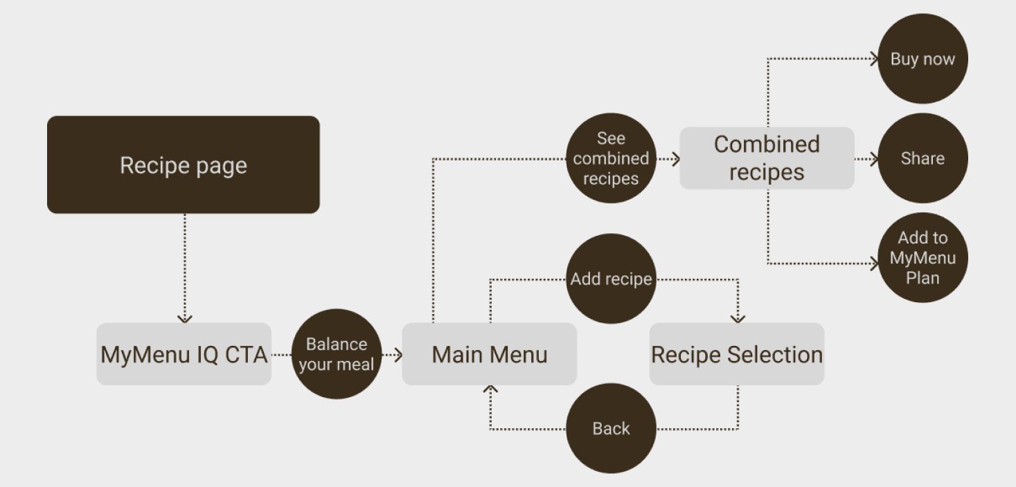
Key Findings
User flow was convoluted and difficult to navigate.
Excessive steps required to complete even simple tasks.
Small and unclear buttons and assets hindered usability.
The user interface suffered from overcrowding, impacting user engagement.
Design
Mid-fidelity Prototype
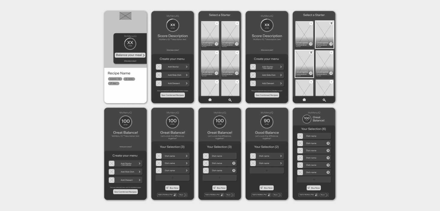
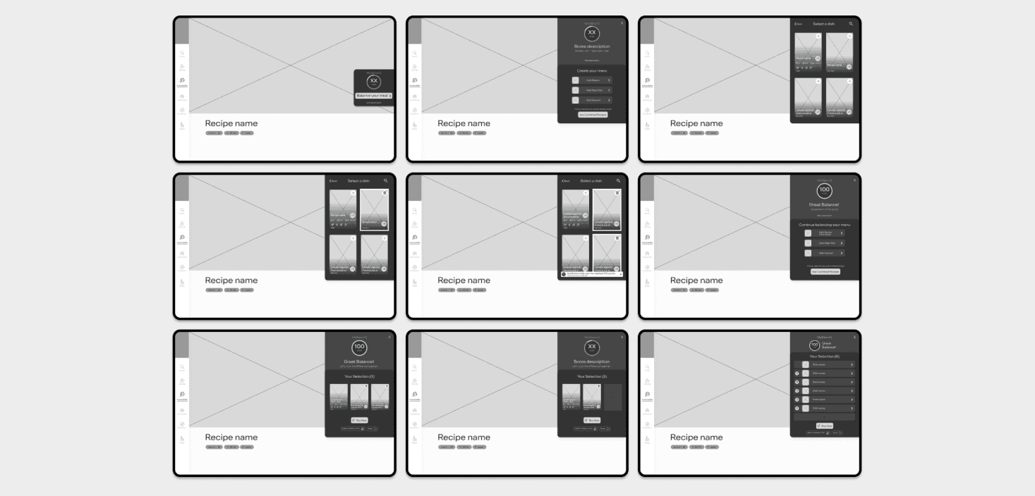
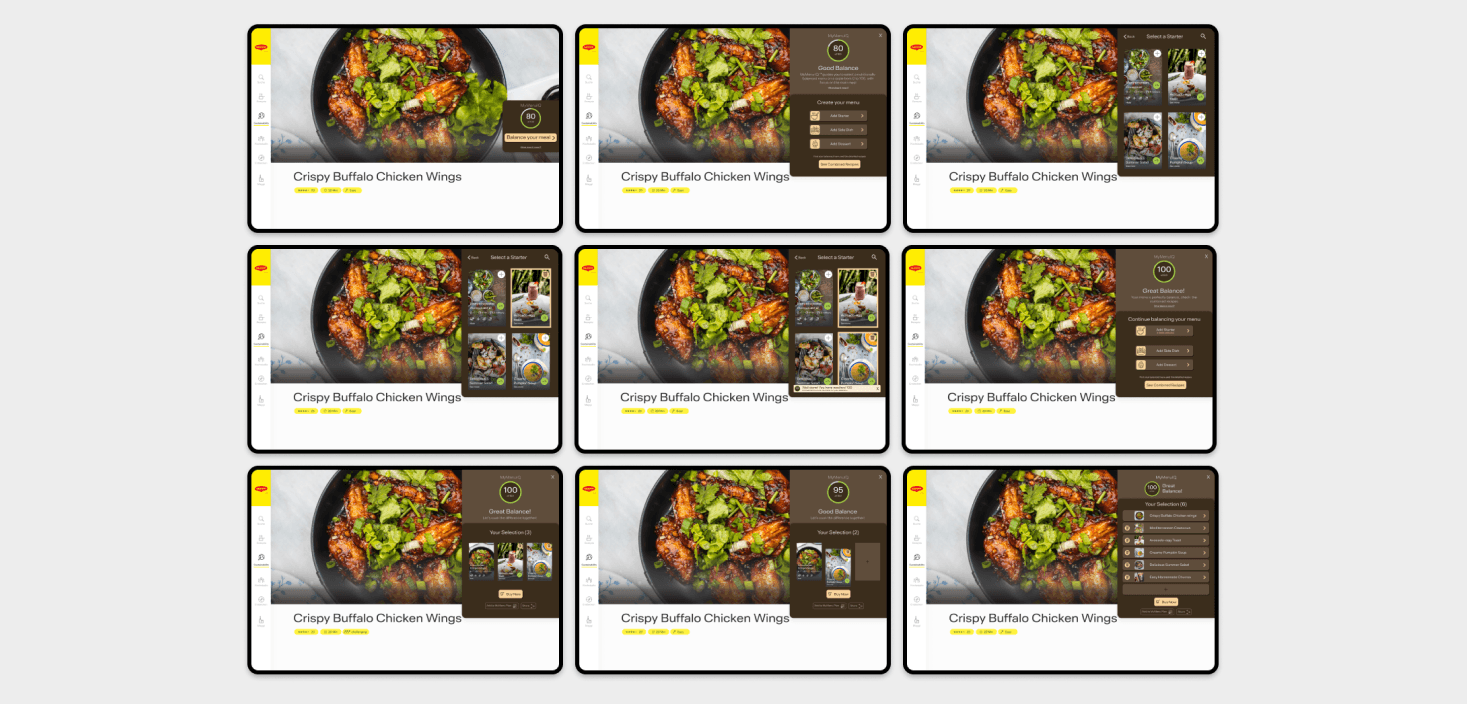
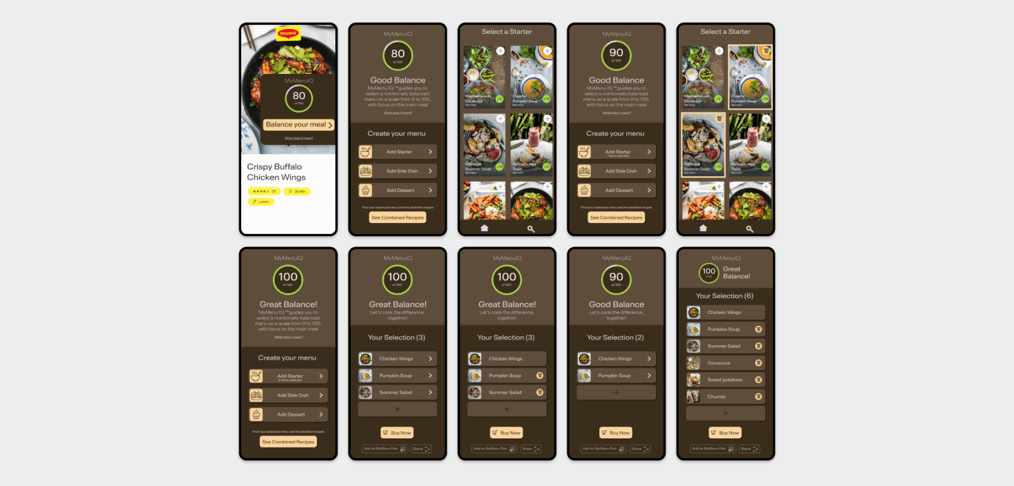
For the MyMenuIQ project, I took charge of designing the mid-fidelity wireframes, focusing on the recipe listing and the menu-building process for both the website and mobile platforms. These wireframes served as a pivotal step in the project's development, allowing us to test and refine the user experience before moving forward with the high-fidelity design. By providing a clear structure and functionality, these wireframes laid the foundation for a user-friendly and intuitive platform.
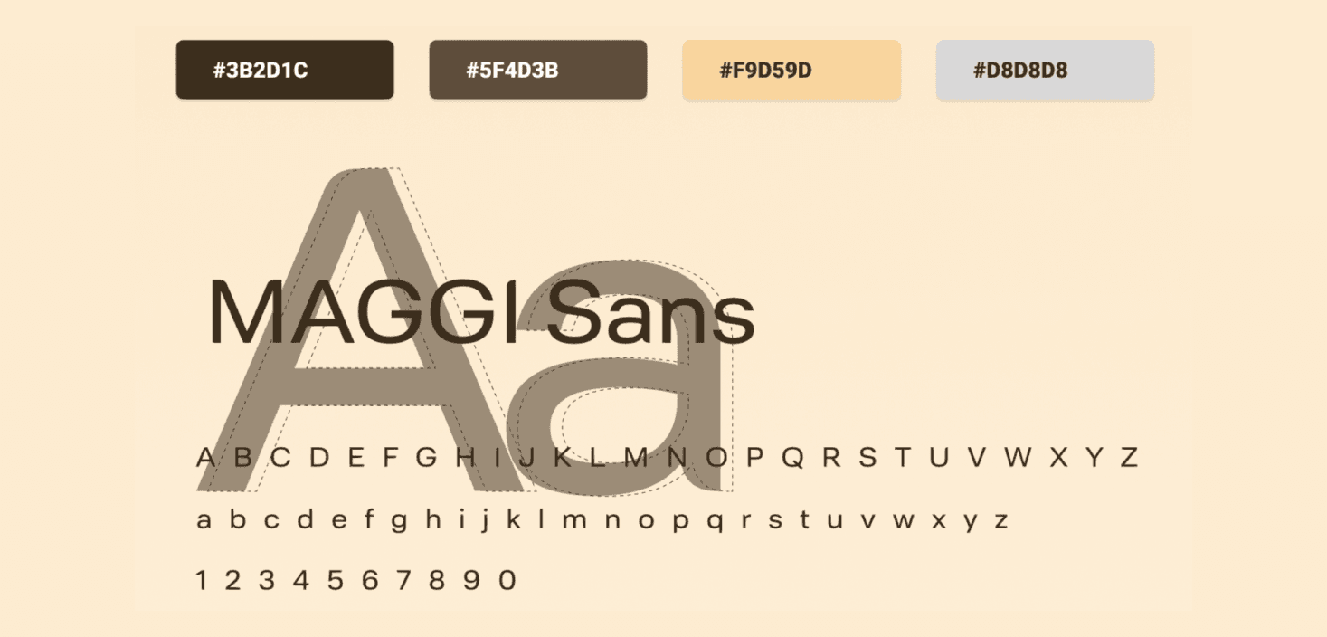
Branding
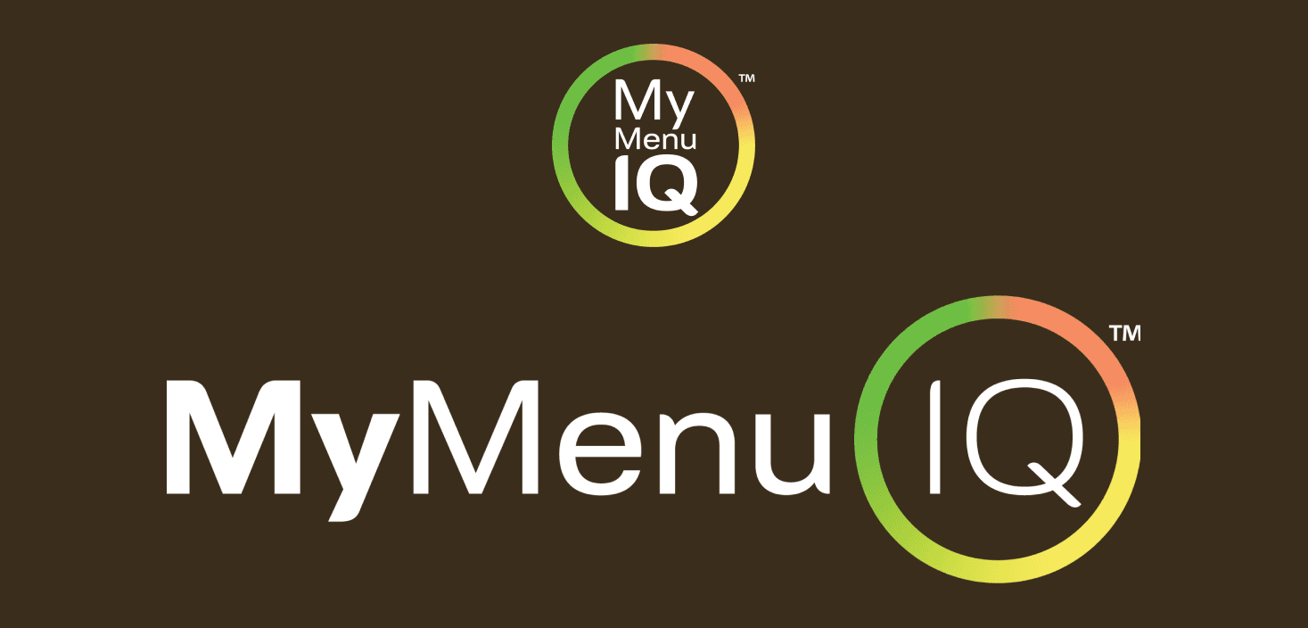
MyMenuIQ's branding was purposefully designed to communicate the scientific expertise that underpins the recipe selections. The warm and welcoming color palette fosters trust and approachability. In alignment with its integration into Maggi's website, the typography seamlessly connects the two brands while maintaining high readability, ensuring that users can effortlessly absorb valuable nutritional information. The MyMenuIQ logo symbolizes Nestle's profound scientific knowledge in nutrition and commitment to delivering that knowledge through a single, user-friendly tool.
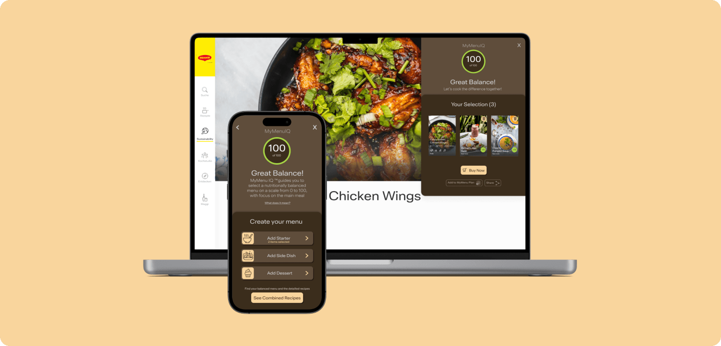
High-fidelity Prototype
As we transitioned to the high-fidelity stage, I worked diligently to ensure a consistent and cohesive brand presence throughout the digital product. This meticulous attention to detail resulted in a visually appealing and user-friendly final design. With the high-fidelity prototype as our guide, we executed the project successfully, ultimately achieving our goal of providing users with a seamless and enjoyable experience while building a healthier and balanced menu through MyMenuIQ. The project's success was a testament to our dedication to user-centered design and collaboration.
© 2025 · Lyne O-R